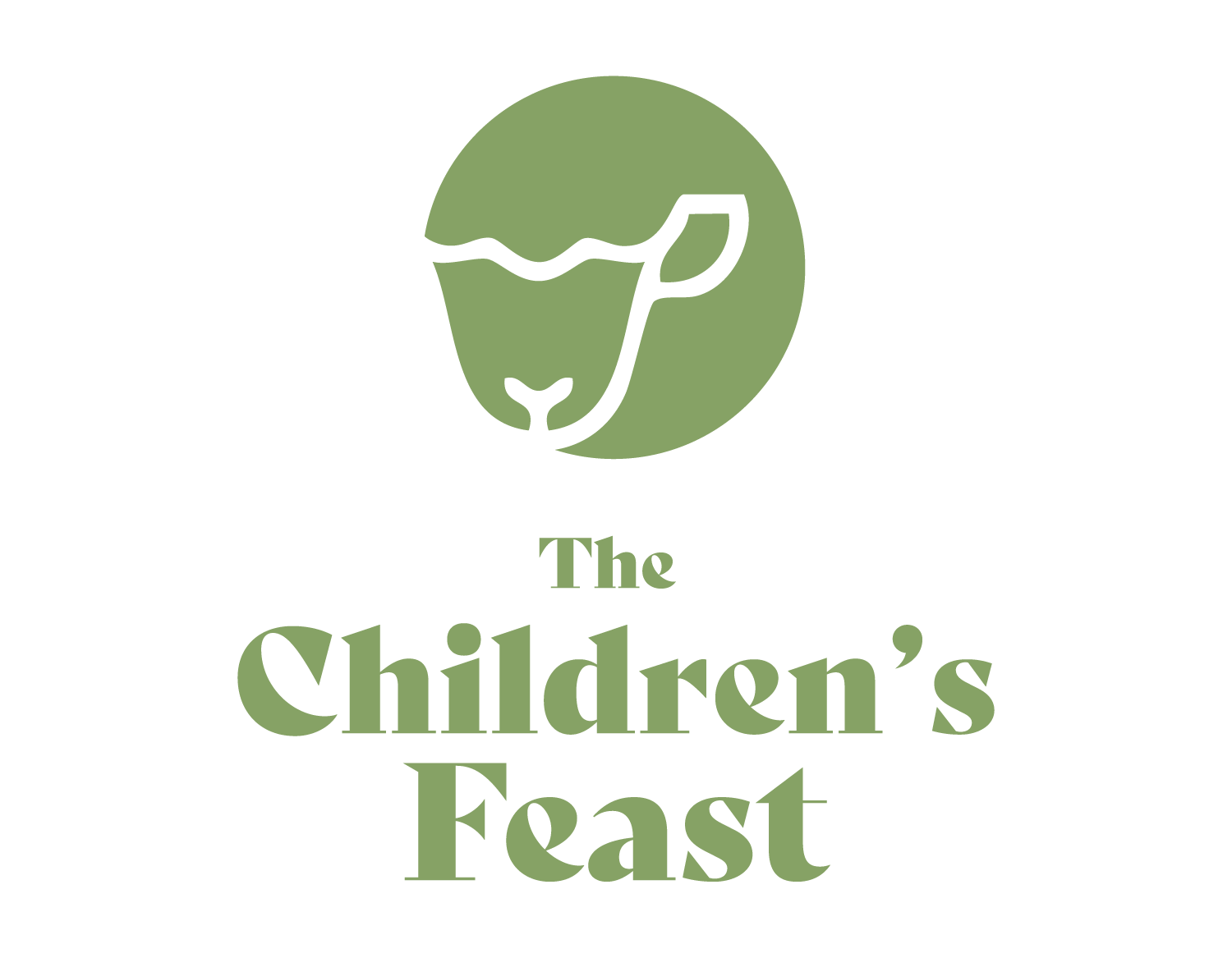
How do you invite children into the richness of God’s Word in a way that feels abundant, beautiful, and simple? That was the challenge The Children’s Feast faced—they had a vision, but they needed a brand that could capture the warmth and depth of their mission.
I designed a logo that reflects their heart: a feast of God’s Word, lovingly set before children. Now, their brand speaks clearly to homeschool parents, Bible teachers, and ministry leaders, drawing them into a vision of nourishment and abundance.
A Brand That Feeds the Soul
The Children’s Feast exists to equip those who teach the Bible to children—homeschool moms, Sunday School teachers, Bible educators—with resources that make God’s Word feel like a feast, not a formula. But before they could serve others, they needed a strong visual identity—one that would invite their audience into a story of beauty, abundance, and simplicity.
Preliminary Sketchbook notes for the project.
They didn’t want a logo that felt corporate or trendy. They wanted something timeless, inspired by the watercolor paintings of missionary Lilias Trotter. The brand needed to feel nurturing and approachable, rooted in Christ’s words to Peter from John 21 to “Feed my sheep.” I worked closely with Lauren to design a logo that embodies this vision.
We explored elements that communicate:
Abundance without clutter – A rich green and inviting design that feels bountiful but not overwhelming.
Beauty with simplicity – A style that evokes creativity, reflecting the organic watercolor paintings of Lilias Trotter
A feast for the eyes and heart – A brand that visually mirrors the depth of God’s Word being lovingly shared.
Beauty with simplicity – A style that evokes creativity, reflecting the organic watercolor paintings of Lilias Trotter
A feast for the eyes and heart – A brand that visually mirrors the depth of God’s Word being lovingly shared.

Secondary Logo for Vertical Use Cases
But a great brand is only as powerful as its usability. That’s why, after finalizing the design, I provided The Children’s Feast with a comprehensive brand guideline—a document that included:
Logo Variations – Multiple formats for different uses (website, print, social media)
Color Palette – A harmonious selection of colors that reflect warmth, growth, and faith
Typography – Thoughtfully chosen fonts that balance beauty and readability
Best Practices – Simple instructions on how to use the brand elements consistently
To ensure a smooth transition, we wrapped up with a consultation call, walking through the guide and answering any questions.
The result?
A brand that felt immediately usable. With clarity and confidence, The Children’s Feast was able to integrate its new logo across its website, email headers, and curriculum materials right away.
Their mission is to nourish children with God’s Word. Now, their brand does the same—welcoming, abundant, and deeply meaningful.
"I would definitely recommend Josh and we plan to use him again for any future design needs. He is kind, professional, knowledgeable, creative, organized, timely, and trustworthy! All wonderful qualities that are hard to ensure are present with other designers."
-Lauren Fee, Founder of The Children's Feast
